
Letter Summary
The start of the second half of 2024 saw a reversal of the U.S. equity market dynamics that dominated for the prior 18 months. Sectors and a select group of names that drove much of the prior gains took a backseat, particularly in the month of July, to sectors that had been left behind. The rotation helped close the underperformance gap for our U.S. large cap portfolio as it outperformed the S&P 500 (SP500, SPX) by 4.74%, net of fees, in the quarter. It may also have provided a glimpse into what areas of the market might benefit if dynamics revert more fully from current richly valued conditions. While equities overall are not as expensive as they were in 2000, they are still expensive and there are a number of parallels to that period that we believe are important to guard against. Crucially, even in that period when valuations were much more stretched, there was a subsegment of the market that remained cheap and that performed very well during the market consolidation that followed. Small cap indexes lifted in the quarter as well, with many of the most levered and least profitable stocks rising most amid hopes for lower interest costs. Given the focus on quality in our small/mid cap portfolio and avoidance of stocks with high debt levels, it lagged the Russell 2000 ETF by 5.18%, net of fees, in the quarter. While lower rates would alleviate the coming refinancing issues in the small cap sector to a certain extent, we still believe that high leverage and a lack of profitability are likely to weigh on longer-term returns. We also do not believe quality needs to be sacrificed to find good values in the space as our portfolio’s free cash flow yield is around 2.5x that of the benchmark. Overall, we believe now is a crucial moment to be selective with heightened equity valuation risk in the large cap space and significant valuation and quality concerns among smaller stocks.
Performance Summary
U.S. Fundamental Stability & Value (U.S. FSV): Despite some relief in the third quarter, enormous gains driven by valuation expansion among a small subset of stocks have left Distillate’s U.S. FSV strategy’s total net return of 15.98% behind the broader S&P 500’s gain of 22.08% during the year. The strategy has performed more similarly to the Russell 1000 Value ETF’s total return of 16.52% over the period. Annualized net of fee performance since inception is 1.66% ahead of the S&P 500 and 4.73% ahead of the Russell 1000 Value ETF.
U.S. Small/Mid Cap Quality & Value (SMID QV): Our SMID QV strategy is trailing the Russell 2000 and Russell 2000 Value benchmarks by 5.48% and 3.40% through the third quarter of this year. Annualized excess returns since inception and net of fees are 7.30% and 7.28% ahead of those benchmarks.
International Fundamental Stability & Value (Intl. FSV): Our International FSV strategy returned 10.89% after fees through the first three quarters of 2024 and trailed the MSCI All Country Ex US ETF benchmark gain of 13.73%. Annualized net of fee performance since inception is ahead of the benchmark by 0.29%.
U.S. Large Cap Value Long 130%/Short 30% (U.S. Value 130/30): Our 130/30 strategy, which by design produces more variable performance, returned 19.72% net of fees through Q3 2024 vs. the S&P 500 Index’s comparable rise of 22.08%. This strategy is 4.44% ahead of the S&P 500 ETF on an annualized net of fee basis and above the Russell 1000 Value ETF by 9.76% since inception.
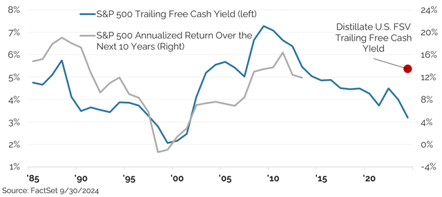
Figure 1: S&P 500 Trailing Free Cash Yield vs. Subsequent 10 Year Annualized Return
Market Commentary:
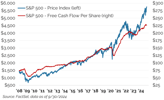
The market in the quarter and year-to-date has moved upward strongly and well ahead of underlying fundamental strength. Through the third quarter of this year the S&P 500 is up 22.1%, far ahead of the 6% increase in rolling next-twelve-month (NTM) consensus estimated free cash flows (See Figure 2). The resulting free cash flow yield, a figure we believe more accurately assesses valuation opportunities than many metrics more commonly discussed, has declined to just 3.9% from 4.5% at the start of the year, and is now well below the 5.4% average over the full period.
Price increases for the S&P 500 continue to exceed free cash flow gains
Figure 2: S&P 500 Free Cash Flow vs. Price
On the basis of a trailing, rather than forward looking free cash flow yield, where we have data going back further to when cash flow statements were first mandated, the market overall looks similarly stretched. The current trailing free cash flow yield of 3.2% for the S&P 500 ranks in just the 13th percentile of its own history. Alternatively stated, the market has been cheaper 87% of the time over that roughly four-decade period. The history is shown in Figure 3 which also includes an overlay of the annualized market return for subsequent 10-year periods. In combination, the chart shows both that the current valuation of the market is expensive versus history, and that subsequent longer-term returns are likely to be more subdued than they have been if the historic relationship between starting free cash flow yields and 10-year forward returns holds.
Though the overall market looks richly valued on measures of free cash flow, it is a highly concentrated market with valuations that we consider extreme in a small group of large market leaders. Other sectors and stocks, however, appear very attractively valued. This backdrop is similar to market conditions back in 2000, when the overall market traded at even richer valuations than is the case today. Crucially though, even in that more expensive market back then, there were still valuation opportunities that performed well even as the overall market fell sharply.
The overall market valuation on trailing free cash yield looks expensive and points to lower potential returns over the subsequent decade.
Figure 3: S&P 500 Trailing Free Cash Yield vs. Annualized 10 Year Forward Returns
Looking back to examine how things played out previously, we are somewhat constrained by the data. Forward looking free cash flow estimates only more recently became available. As a result, we turn instead to price-to-earnings (P/E) ratios. We have written extensively about the problematic nature of P/E’s, but believe there remains a story worth examining even though we much prefer to use free cash flows to gauge fundamentals and valuation.
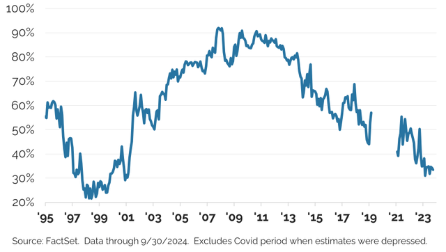
Using forward looking earnings estimates, we split the market into stocks trading at next-twelve-month P/E (NTM P/E) ratios over 30x and under 20x. In 2000, over 50% of the S&P 500 by market cap was trading at an NTM P/E above 30 (see Figure 4). As a point of comparison, only about 10% of the market then traded at similar levels for much of the next twenty years. The pandemic then renders the data less helpful due to depressed and highly volatile earnings estimates relating to uncertain economic conditions. More normal earnings estimates began again in late 2021, hence, the gap in Figures 4 and 5. After this long stretch when this share of the market hovered around 10%, it has moved sharply higher in the last 18 months and now more than 40% of the S&P 500 is trading at an NTM P/E over 30. This is a remarkably high figure that raises concern about valuation risk in the market overall.
Over 40% of the S&P 500 is now trading at an NTM P/E over 30x.
Figure 4: Share of the S&P 500 With a P/E Over 30x
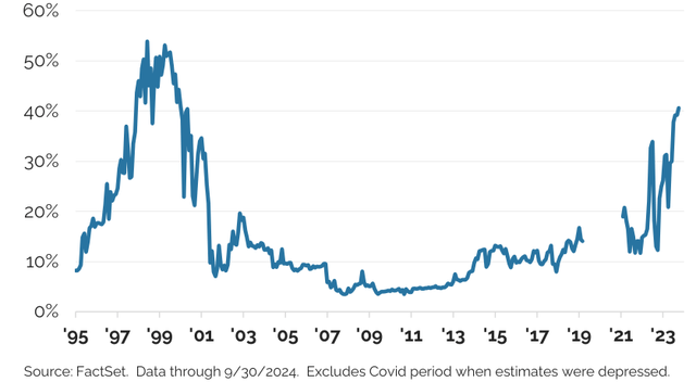
Figure 5 depicts the share of the market trading at an NTM P/E under 20x. Similar to the pattern in the previous figure, a relatively small share of the market was in this inexpensive segment during the TMT bubble in the late 1990s and early 2000. Since then, a larger portion of the market traded below this threshold with more than 90% of the market at that level on several occasions. Most recently, however, the share of inexpensive stocks has dropped back to a very low level and stands at about 30% of the market today.
Only ~30% of the market is trading at an NTM P/E under 20x currently.
Figure 5: Share of the S&P 500 with a P/E Under 20x
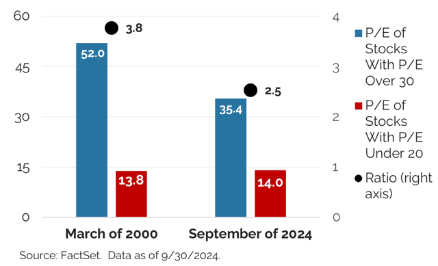
Figures 4 and 5 highlight the similarities between the market in 2000 and today, but there are also some key differences. A larger percentage of the market was trading at expensive multiples in 2000, but a similar portion was trading at less expensive levels. The overall NTM P/E for that group of stocks trading in excess of 30X in March of 2000 was also much higher at 52.0x vs. 35.4x today (see Figure 6). So, a larger share of the market was expensive in 2000 and that portion was more richly valued than is the case now. The figures for the inexpensive stocks now and in 2000 are remarkably similar. The aggregated P/E for those stocks trading at less than 20x earnings was 13.8 in 2000 and is currently 14.0x. Figure 6 also highlights the greater disparity in 2000 as a ratio of the valuations then and now.
The inexpensive portion of the market currently looks similar to that in 2000 while the expensive portion is not as extremely valued.
Figure 6: Comparison of the Expensive and Inexpensive Portions of the S&P 500 in 2000 and Today
These observations are consistent with the trailing free cash flow yield in Figure 3 that shows the current level at just over 3%- expensive, but not as expensive as the 2% level reached in the TMT bubble.
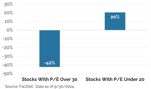
Getting to the point… what happened next? Figure 7 shows that two years post the first quarter of 2000, the expensive P/E group was down in aggregate 42%, while the inexpensive portion was up 20% despite the broader market selloff. Even in 2000, when there was enormous valuation risk in the overall market and it subsequently suffered a sharp decline, there was an inexpensive portion of the market that actually performed very well.
Two years later, while the expensive (NTM P/E over 30x) portion of the market from March of 2000 was down sharply, the inexpensive group (NTM P/E under 20x) was up 20% despite the broader market decline.
Figure 7: Two Years Post March 20 0 0 Peak, Performance of High and Low P/E Groups
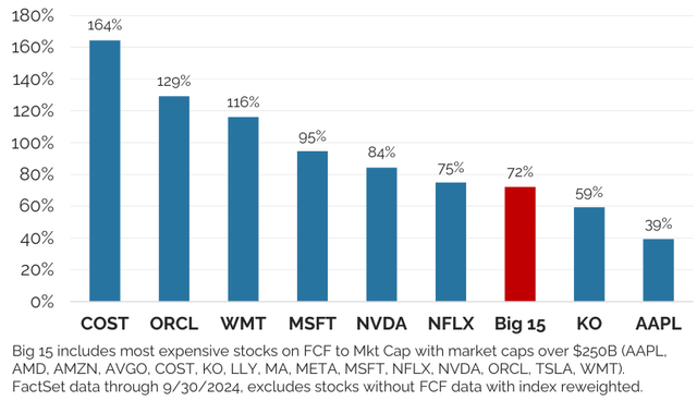
Much of the valuation risk in today’s market in our view is concentrated in relatively few names. Returning to an analysis of forward-looking free cash flows and examining free cash flow yields, the most expensive 15 stocks with market capitalizations over $250 billion are currently trading at a 72% premium to the rest of the market. This is shown in Figure 8 which depicts the valuation for a select number of these stocks on next-twelve-month estimated free cash flows as well as that of the full group of 15, relative to the rest of the market.
Those 15 stocks now collectively account for almost 40% of the total market capitalization of the S&P 500-an enormous degree of concentration among a small group of expensive stocks. While great success may indeed come to these 15 businesses, very lofty expectations are embedded in their prices, and should those expectations fall short, the risk/reward skew for those company’s shares in our view may prove highly unfavorable, just as was the case in 2000.
Valuation risk is concentrated as just 15 megacap (over $250 billion) stocks that account for almost 40% of the total market are trading at a 72% premium to the rest of the S&P 500.
Figure 8: Free Cash (NTM) Valuation of the Richest Megacap 15 Stocks vs. the Rest of the Market
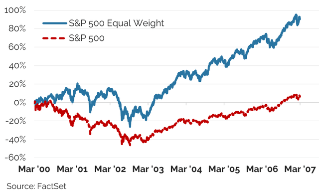
This same dynamic is evident in looking at an equal weighted version of the S&P 500 versus the typically quoted cap weighted one. In 2000, the biggest stocks were also the most expensive. As that group’s valuations came back into line, the equal-weighted S&P 500 significantly outperformed the capitalization-weighted version (See Figure 9). While it took almost seven years for the cap weighted S&P 500 to get back above zero, the equal weighted version had risen by over 80%.
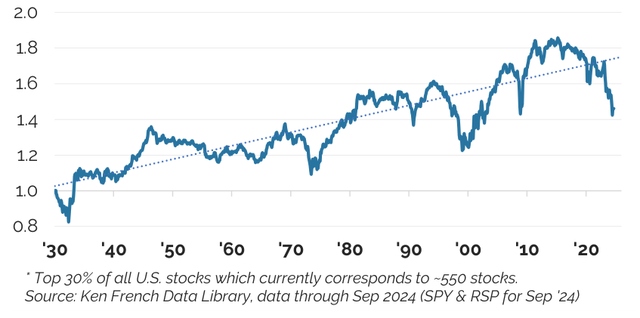
Equal weighted benchmarks also do better than cap-weighted benchmarks over longer periods of time. This occurs because the largest stocks tend not to remain so over multi-decade periods as forces of creative destruction and the sheer challenges of size typically create significant turnover in their ranks. Figure 10 shows the results going back to 1930 and clearly depicts the better fortune of being in an equal weighted group of stocks over the entirety of the period. Periodically however, the opposite occurs with valuation expansion among the largest stocks usually being a key driver, sometimes to a point of extremes. The Nifty-50 craze in the 1970s, the TMT Bubble, and our current situation all stand out graphically. Crucially, in past episodes, the equal weighted index sharply rebounded as valuations of the largest stocks eventually returned to more typical levels and the biggest stocks lagged.
An equal weighted version of the S&P 500 dramatically outperformed the capitalization weighted index in the wake of the TMT bubble.
Figure 9: Equal vs. Cap Weighted S&P 500 Post-2000
Over the long-term an equal weighted index of large U.S. stocks has outperformed the capitalization weighted index.
Figure 10: Equal vs. Cap Weighted Large U.S. Stocks
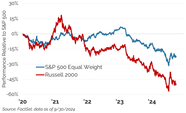
In July we witnessed a brief period of an unwind in some of these dynamics in ways that was reminiscent of what occurred on a much larger scale in 2000. Relative valuations of AI-related and a handful of the other expensive stocks reached a peak around July 10th and then partially reverted in a short period that saw unusual relative strength for the equal weighted index and smaller stocks more broadly. This is evident graphically in Figure 11 which plots the relative performance of both the S&P 500 Equal Weight Index and the Russell 2000 relative to the S&P 500. For a sense of how unusual these moves were, the 10-day relative performance of the Russell 2000 benchmark, up more than 10 percentage points over the S&P 500, was the largest relative move in a 10-day period over the nearly 50-year history of this benchmark. It is also notable that these recent price moves were more significant than those witnessed during the pandemic when there was enormous uncertainty that contributed to significant price fluctuations.
July saw very sharp and unusual intra-market moves with the equal weighted SP 500 and Russell 2000 ETF outperforming the broader S&P 500 substantially in a very short stretch of time.
Figure 11: Performance Relative to S&P 500
We experienced strong outperformance in our large cap U.S. FSV strategy in that same 10-day window which is consistent with our avoidance of the largest and coincidentally most expensive stocks. Our U.S. Small/Mid QV strategy, however, lagged behind its benchmark as its focus on quality caused it to trail the more indiscriminate rise in the Russell 2000 benchmark where many unprofitable and highly levered stocks rose the most sharply.
There was no clear impetus for the sudden and significant movement in July. Explanations ranged from an unwinding of the yen carry trade, to changing expectations around Federal Reserve policy, to shifting political polls, to a moderation in AI enthusiasm. In our experience, when this many reasons are offered, the best answer is that no one has any idea why something happened. That such a sudden change occurred at all and did so without a clear reason is indicative of a market that is being driven more by sentiment than fundamentals, is reminiscent of conditions 25 years ago that also experienced myriad sudden and sharp price moves. In another parallel to that time, this year has seen 15 of the 20 largest-ever single stock daily valuation changes. NVIDIA alone accounts for 12 of those largest single day moves with the company having gained or lost over $175 billion in market value (and often much more) in a single trading session.
Volatility is a given and experience tells us that fundamentals and prices can disconnect, sometimes in big ways and for extended periods. Current valuations are bifurcated and significantly so, even versus extreme points in market history. We will continue to be patient and rely on the underlying fundamentals to guide our portfolios, knowing that time and again, stocks prices ultimately reflect the fundamentals of the businesses they represent.
U.S. Large
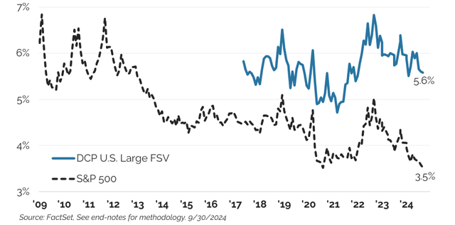
In this environment, where our U.S. FSV portfolio is avoiding the largest most expensive stocks in the market, the result is an enormous valuation divergence in our strategy versus the market. While the S&P 500 has seen its free cash flow to enterprise value yield decline from around 4.5% to 3.5% in the seven years since we launched our strategy, the comparable metric for our U.S. FSV strategy remains largely unchanged and ended the quarter at 5.6% (See Figure 12). Our yield advantage versus the S&P 500 is near the highest it has ever been, and in an absolute sense, the free cash flow yield is at the same level as was the overall market during the depths of the GFC in 2009, an entry point for equities which in retrospect turned out to be very fortuitous.
The NTM free cash to EV yield for Distillate’s U.S. FSV remains roughly where it was when the strategy began while the S&P 500’s has fallen sharply with the result that the valuation differential is extremely wide.
Figure 12: Free Cash to Enterprise Value Yield for Distillate’s U.S. FSV Strategy vs. the S&P 500 Small/Mid
Small/Mid
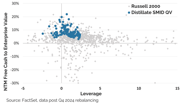
We see much the same polarity in the opportunity set in the small and mid-cap space as in the large space As we have suggested in prior letters, the broader small stock indexes do not look that attractive in aggregate when properly assessed. There are two key reasons for this. First, the small stock indexes include a large portion of unprofitable stocks that are dragging down the valuation of the overall group. Second, small stocks have very high debt loads at present and this too is weighing on valuation when leverage is considered. Fortunately, there is enormous dispersion in the small cap space that allows us to navigate both issues. Figure 13 highlights our positioning across valuation and leverage while also showing the enormous range within the broader market on these measures.
Distillate’s Small/Mid QV’s holdings have both low leverage and high free cash yields while the rest of the small cap market is highly scattered.
Figure 13: FCF/EV Yield vs. Leverage by Stock
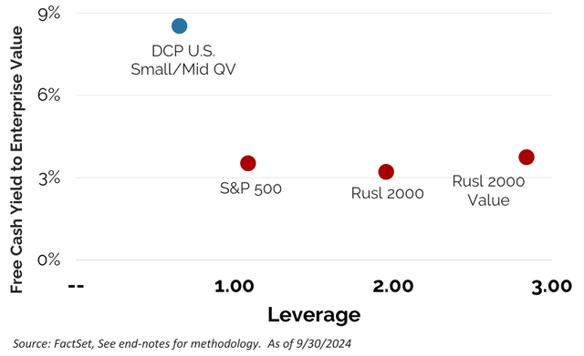
When these individual holdings are aggregated into our Small/ Mid QV portfolio, the result is a substantially better valuation and much lower leverage than the small cap or large cap benchmarks (see Figure 14). Note that the small stock benchmarks overall are unattractive, trading at a similar valuation as the S&P 500. This runs counter to much Wall Street commentary which typically relies on P/E-based valuation measures that exclude unprofitable companies and ignore debt.
Small stocks in aggregate do not look especially attractive vs. large stocks when leverage and negative earning stocks are included,, but Distillate’s Smid QV strategy does.
Figure 14: FCF/EV Yield vs. Leverage by Portfolio
International
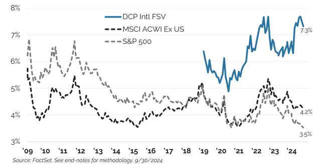
International stocks also look more attractive than U.S. large-cap stocks at present. Fifteen years ago, international stocks were more expensive than U.S. stocks on the basis of a free cash flow yield. They also had more debt, a legacy of less stable cash flow generation, and faced slower growth. In combination, this made the U.S. market look like the clear winner from an investing perspective despite much commentary to the opposite. Now, after a long period of underperformance, international stocks are finally less expensive than their U.S. counterparts and look appealing on a relative valuation basis.
The history of overall U.S. and international valuations as well as that of our own strategy are shown in Figure 15. International stocks do still have more debt and less stable cash flow profiles, but again those risk can be reduced by filtering out highly levered or fundamentally less stable stocks as our investment process does. Recognizing we risk being the proverbial broken record, we believe being selective is critical in improving the probability of success over the long term by gravitating to those stocks that are the least expensive that meet our quality criteria.
Distillate’s Intl. FSV’s FCF/EV yield is well above that of key benchmarks.
Figure 15: Free Cash to EV vs. Leverage for Distillate’s Intl Strategy vs. Various Benchmarks
Final Word
Large cap U.S. stocks in aggregate look expensive. They rank in just the 13 th percentile on the valuation measure of trailing free cash flow yields going back to when cash flow data first became mandated and available in the mid-1980s. Historically, the price you pay, in this case the starting free cash flow yield, has provided a good guide for annualized returns over the next decade, and this relationship now points to much more modest gains going forward for those buying the index. But investors do not have to own the market in its entirety and there remain very attractive parts of the U.S. market today, just as there were in the even more richly valued period of the TMT bubble. Those less expensive stocks in 2000 subsequently performed very well despite the broader market’s decline and we believe there is a reasonable probability that the same could occur for the less expensive portions of the market today.
We do not intend this to sound like any sort of market prediction or expectation of an impending decline. As Warren Buffett wisely said, “the only value of stock forecasters is to make fortune tellers look good.” Rather, we are highlighting a valuation risk in the market at present because we see it as our job to try to mitigate investing risk for our clients over the longer term. In that effort, our investment process starts by seeking to protect against the impact of negative economic or other fundamental shocks. We do that not by focusing on stock prices, but by focusing on each company’s risk profile. Critically though, a high-quality company can become a risky stock if the price paid is too high. Our process therefore seeks to also protect against valuation risk by investing only in the most attractively valued businesses that meet our quality criteria. It is valuation risk that looks to be the greater one at present.
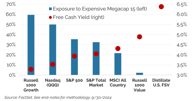
In an effort to mitigate this risk, our U.S. FSV strategy looks very different from many large-cap benchmarks and portfolios. The exposure to the most expensive megacap 15 stocks that we highlighted earlier is significant across many common benchmarks, while the weight in our U.S. FSV strategy is zero. Figure 16 depicts this along with the NTM free cash flow yield for our strategy and various benchmarks. The chart highlights the significant weight of the big-15 in each benchmark and shows the inverse impact that weight has on valuation.
Exposure to the 15 most expensive megacap stocks is high across common benchmarks, but zero for our U.S. FSV strategy. Valuations also inversely track exposure to this group.
Figure 16: Expensive Megacap 15 Weight vs. Valuation
As Benjamin Graham is purported to have said, “in the short term, the market is a voting machine. In the long term, it is a weighing machine.” This has proven true around periods of stock market optimism fueled by new technologies in the past like in the TMT bubble and in the Nifty-Fifty craze in the early 1970s. In those periods, the less expensive equal weighted index underperformed, but then strongly recovered in the aftermath. The current dynamic appears somewhat similar and we are pleased to look more like the equal weighted index.
Smaller and international stocks also offer an important counterweight to valuation risk among larger U.S. stocks so long as selectivity is employed. This means avoiding unprofitable and highly indebted smaller U.S. stocks and navigating around valuation and quality issues in the international space.
Original Post
Editor’s Note: The summary bullets for this article were chosen by Seeking Alpha editors.
Read the full article here